Party! It's Friday night! Let's watch a documentary about a typeface! OK!
I really enjoyed it. It'd been in our NetFlix queue ever since January, but Kim kept moving it to the end. She thought it would be geeky and boring. We're talking about important worldwide design here, woman, not how to type and kern a logo. Turns out she wasn't bored because of all the interviews with lots of design guys from different countries, including at least one who worked on Helvetica. There was even an appearance by Hermann Zapf. Yup, the guy who made Zapf Dingbats, Zapf Chancery, and many others we've all seen or used.
There was one German guy who was really interesting to listen to, especially when he got into the inclusion of Helvetica on Macs, then how Windows didn't want to pay to license it, so they used Arial instead. (Which is like the retarded, ugly, WalMart version of Helvetica. Even Kim noticed how ugly Arial was when one of the online games she plays daily changed their entire look, including the font. She mentioned how horrible it looked and how hard to read it was. I took a quick look and said, "Arial".) He was going on about how Microsoft stole all their ideas from Apple but never have enough sense to change it for the better. Everything they steal ends up being shittier and of less quality and usability. Enough about those dipshits.
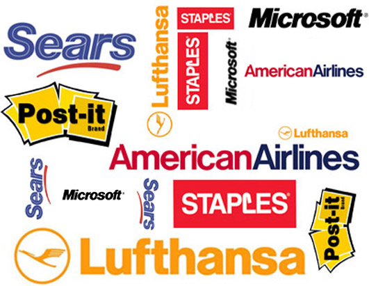
What was most amazing is the vast proliferation of the use of Helvetica throughout the world. Sure, it's all over the place in Switzerland (it's a Swiss font), but almost any place you look in the US, you'll see it. The Target logo is Helvetica.
Friday, May 1, 2009
Subscribe to:
Post Comments (Atom)

No comments:
Post a Comment